
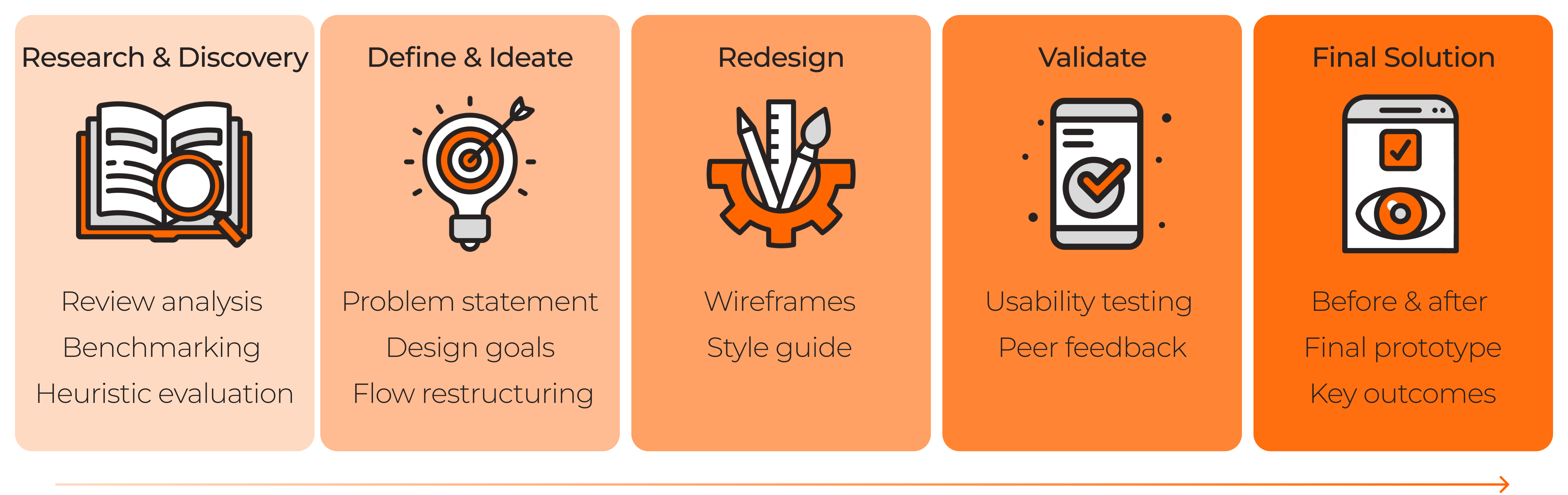
Research & Discovery
Review analysis, benchmarking, heuristic evaluation
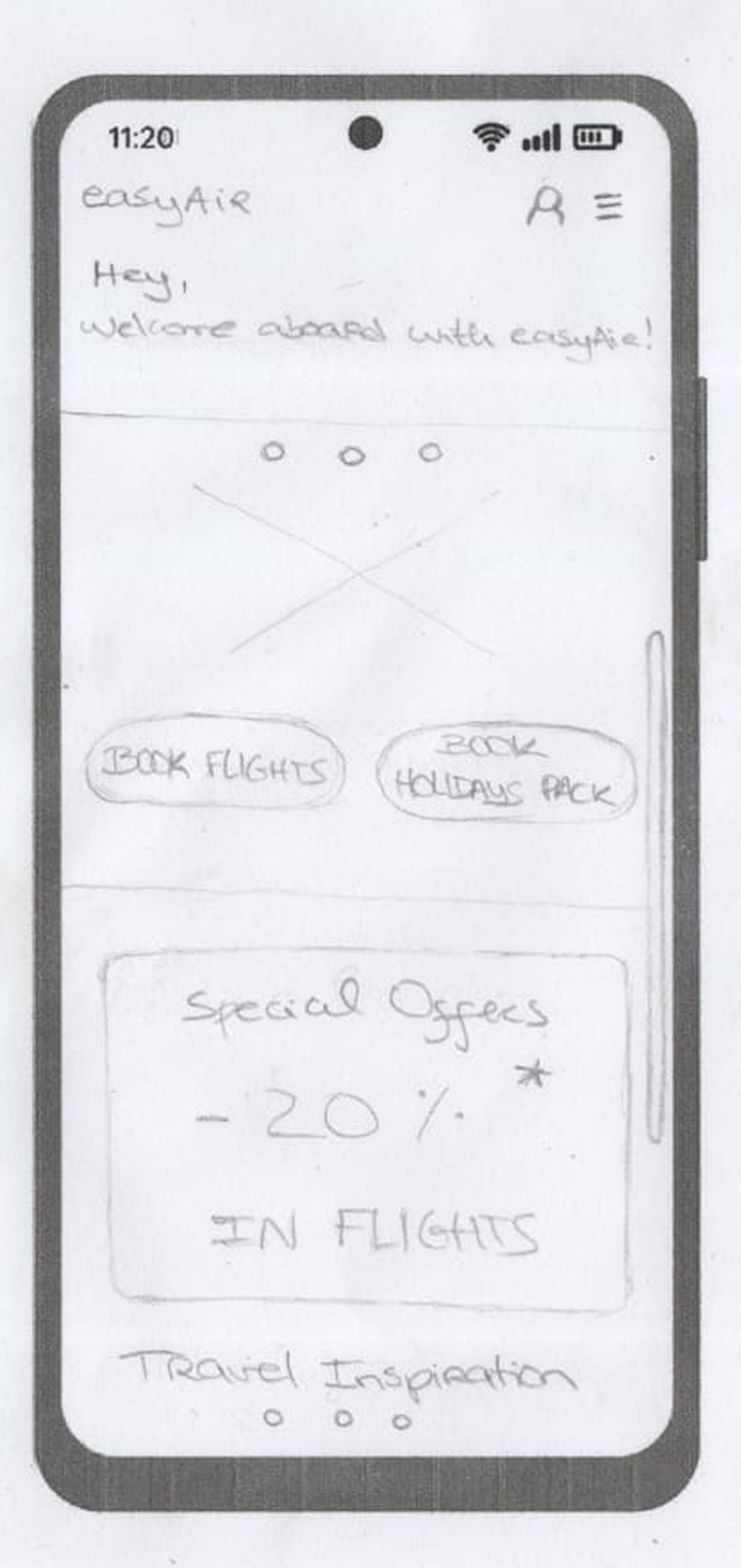
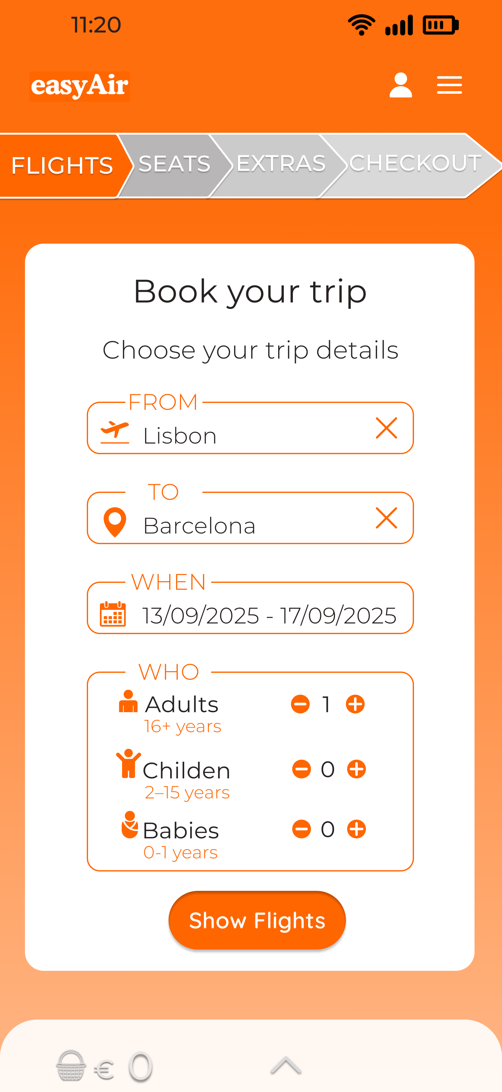
Airline booking flows should help users feel in control, not question every extra cost. easyAir rethinks easyJet’s mobile booking journey by turning 8 fragmented steps into 4 clearer decisions, making the flow easier to understand without hiding revenue-driving extras.
This speculative redesign started by investigating where users lost confidence in easyJet’s booking flow. I analysed user reviews and the existing journey to identify moments of uncertainty, pressure and confusion, then redesigned the decision sequence and tested the prototype against the original flow to evaluate clarity, speed and perceived control.
I structured the project into five stages, from research and problem definition to redesign and validation.
Review analysis, benchmarking, heuristic evaluation

Problem statement, design goals, flow restructuring

Wireframes and style guide
Usability testing and peer feedback
Before/After, final prototype and key outcomes
User reviews pointed to recurring problems across the booking journey: unclear fees, confusing labels, repeated upsells, and frustration around seats, bags, insurance, and car rental.
Charging extra to choose seats... then overrides your original seat (and payment). Told you have to pay extra to change your seat back to the original one you already paid for.
Key insight
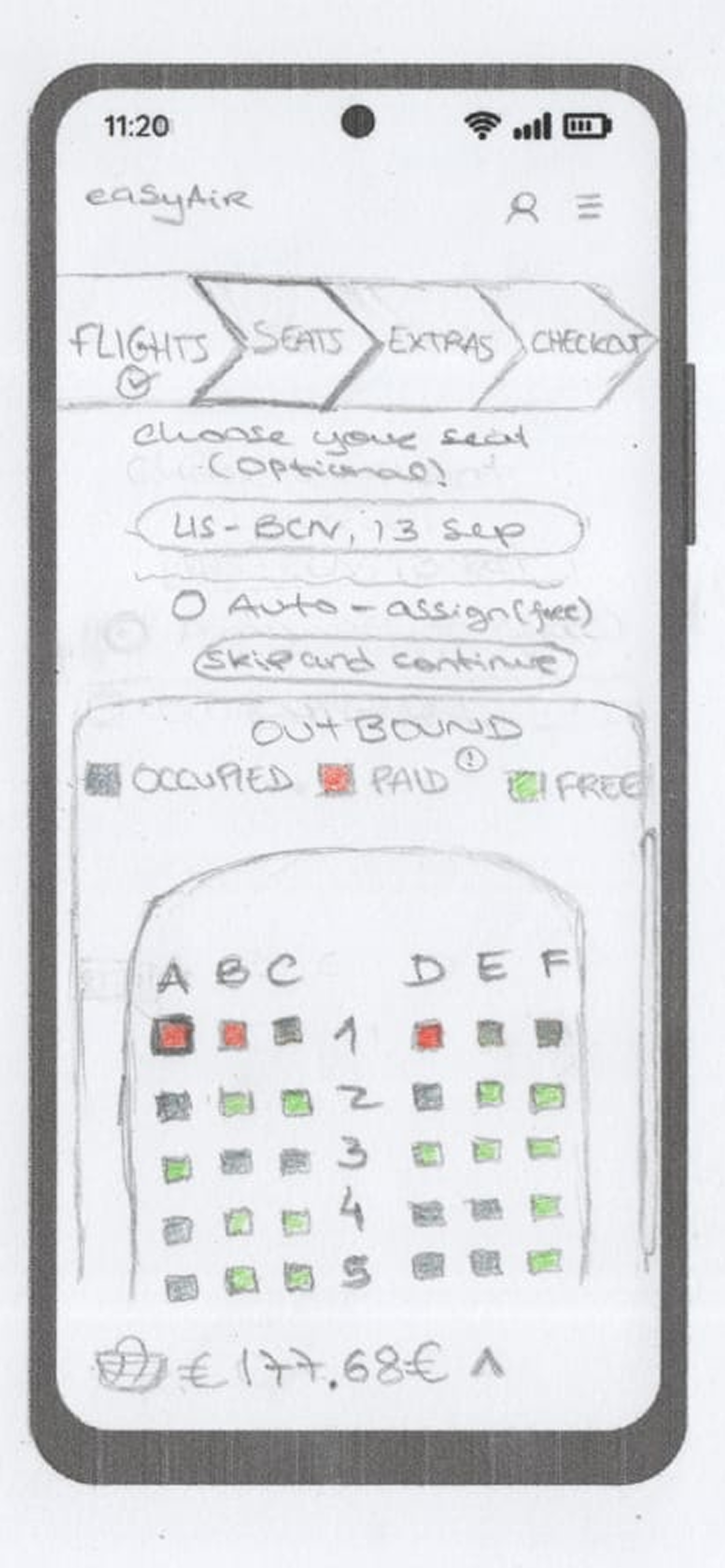
Users paid for control, but the experience made seat choice feel unreliable.
The checkout process is predatory and makes it very easy to add charges unintentionally.
Key insight
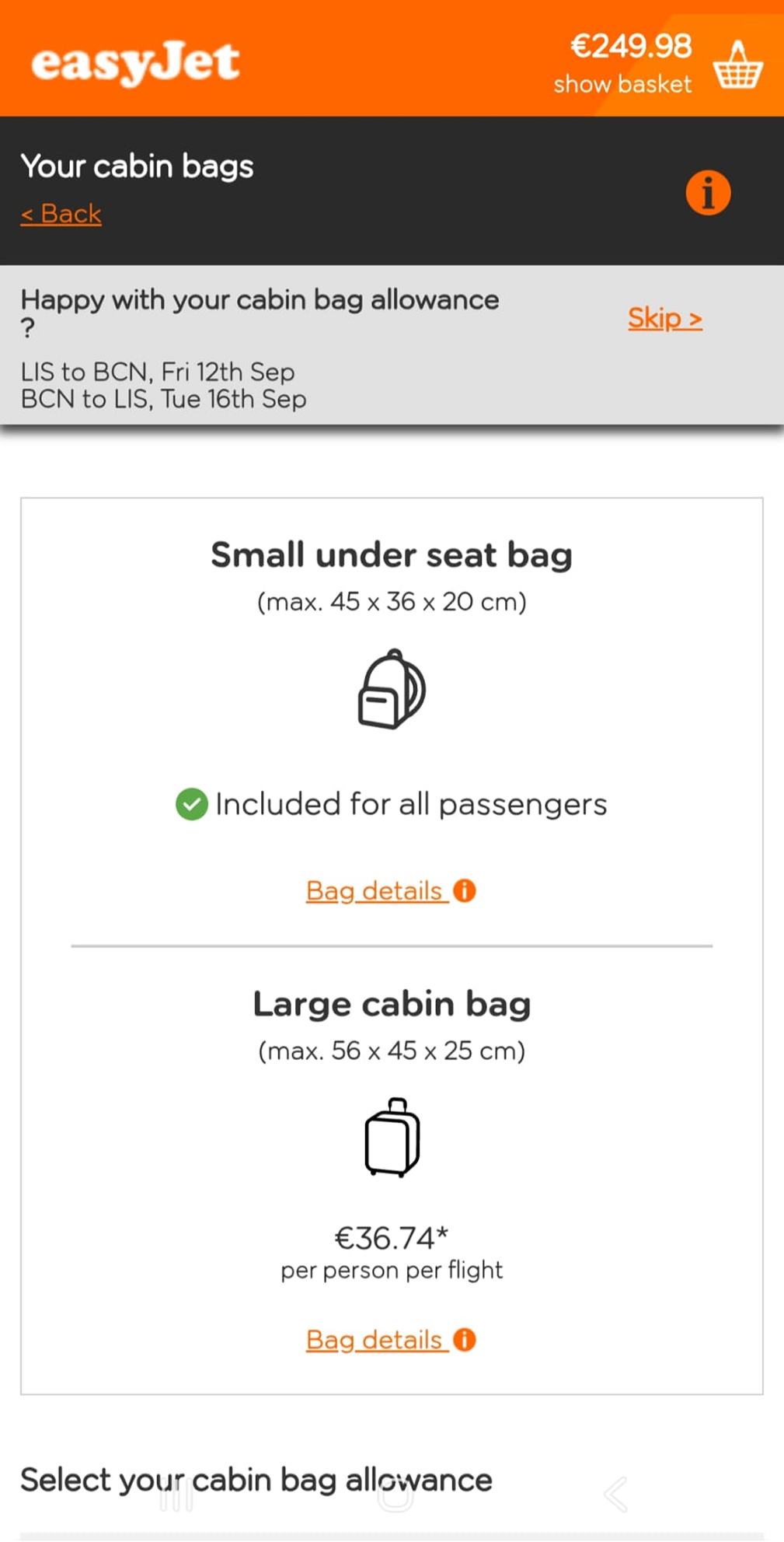
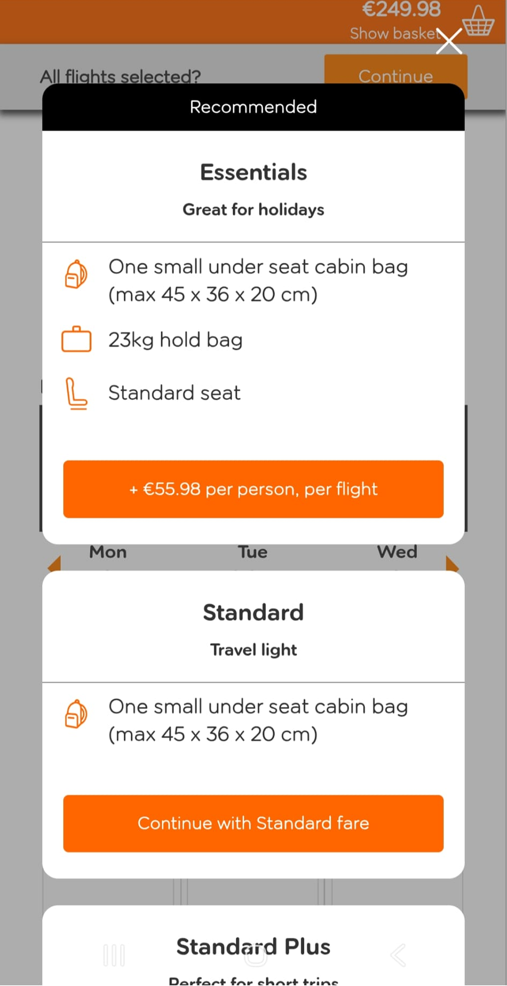
Extras were too easy to add by mistake and too hard to review with confidence.
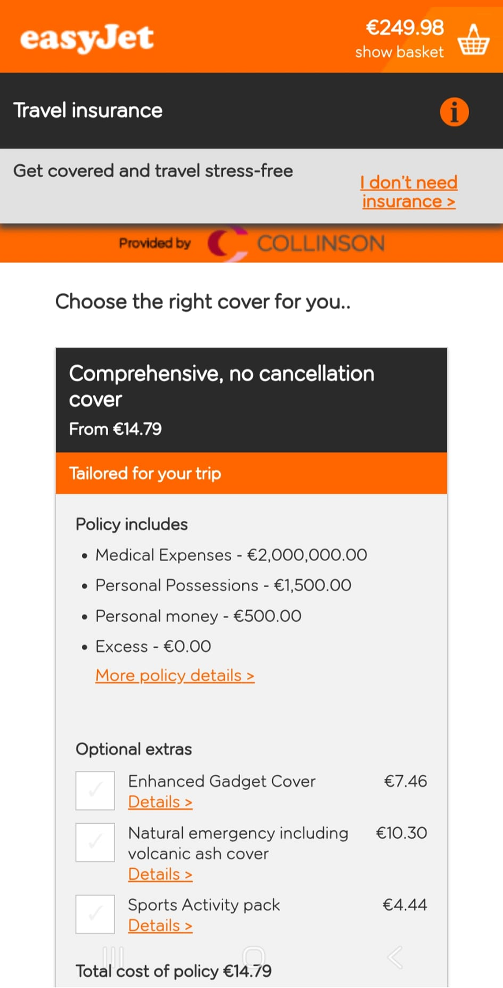
Bought their insurance... at the airport told me the insurance wasn’t valid and pressured me into buying theirs.
Key insight
Insurance felt unclear and untrustworthy when coverage expectations did not match reality.
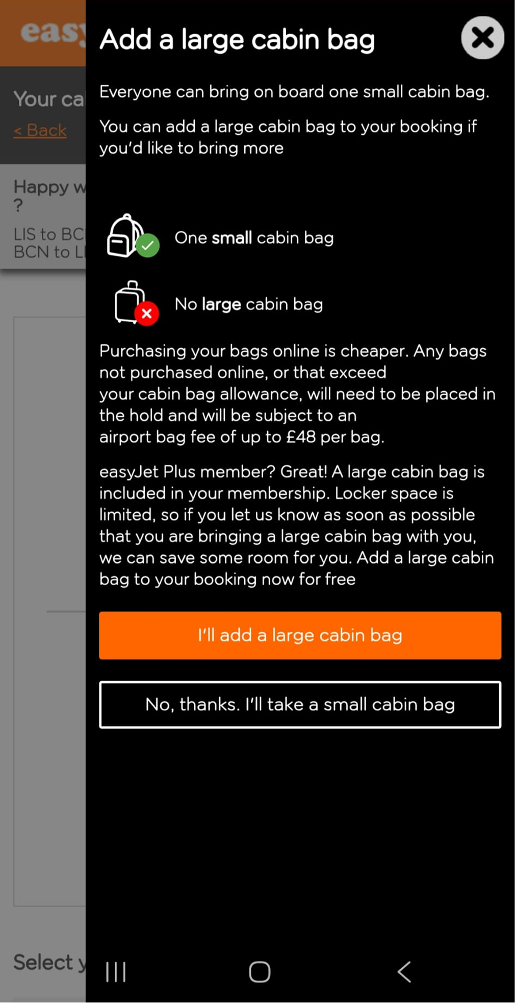
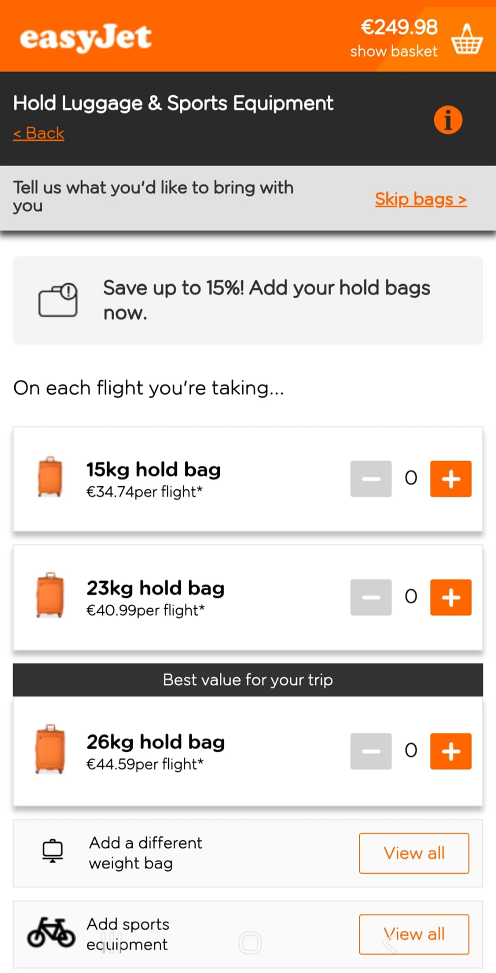
I didn’t want a large cabin bag, nor did I travel with one, yet I was forced to pay for it.
Key insight
Bag charges felt forced rather than optional, making pricing harder to trust.
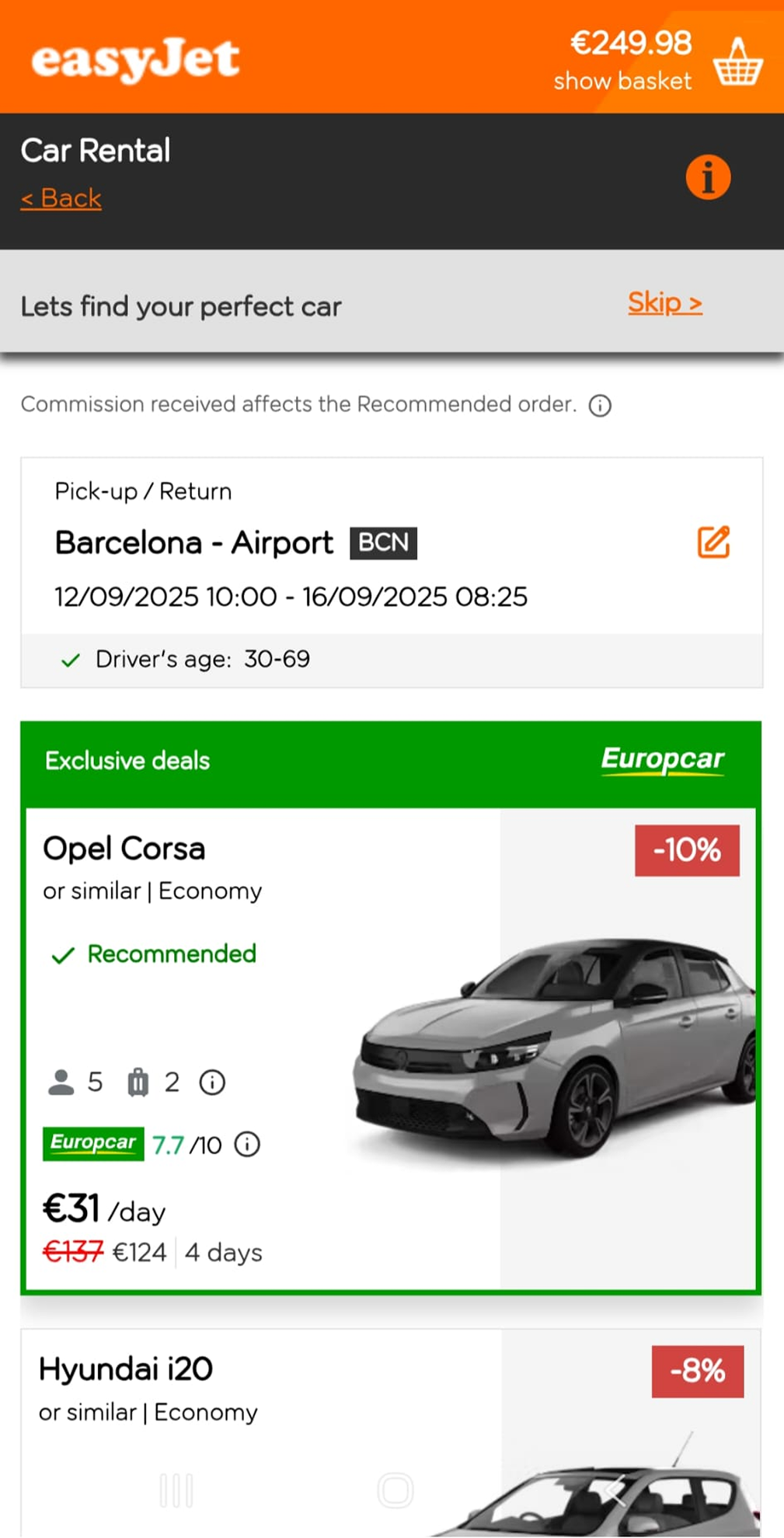
Booked a car through EasyJet and the hire company tried to rip me off. Walked away with no car and EJ took the full hire fee. EasyJet took no responsibility.
Key insight
Third-party extras felt risky because accountability was unclear when something went wrong.
What the reviews revealed
Across these reviews, the issue was not simply that extras existed. The deeper problem was that users felt unsure about what they had selected, what they were paying for, and whether they could easily change their choices.
Beyond the reviews, benchmarking and a heuristic audit showed that the issue was less the extras themselves, and more how fragmented, unclear, and difficult to follow the journey felt.
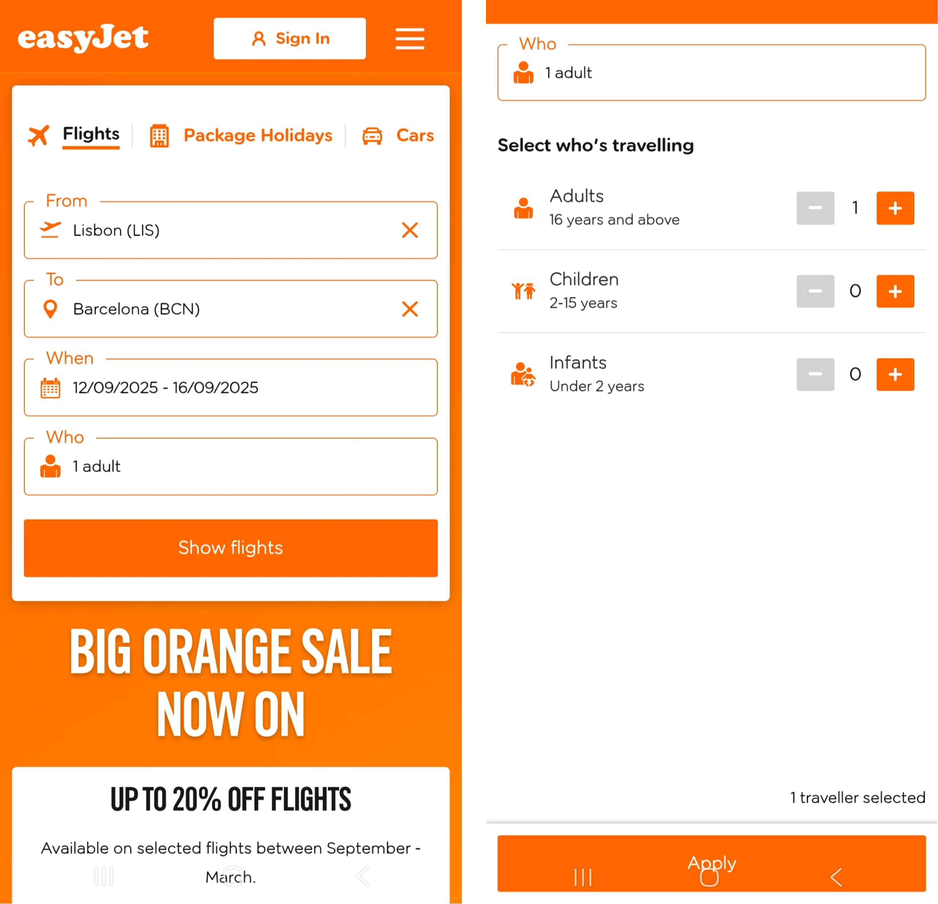
Benchmarking
UX Audit
These findings shaped the redesign priorities: simplify the structure, clarify labels, make pricing easier to follow, and give users more control over extras.
The booking flow was fragmented, upsell-heavy, and difficult to follow. Repeated screens, unclear labels, and poor visibility of costs made the journey feel confusing and harder to trust.
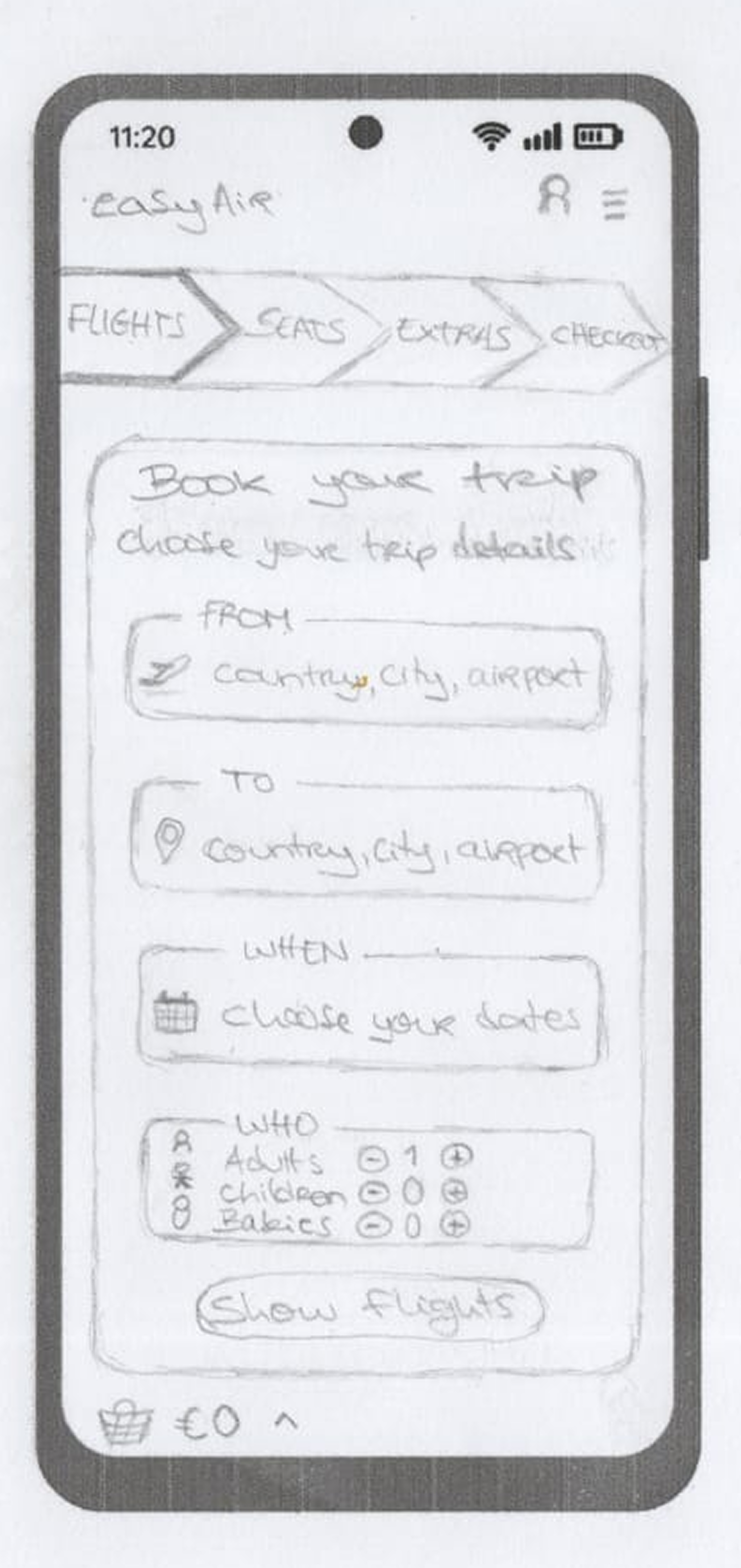
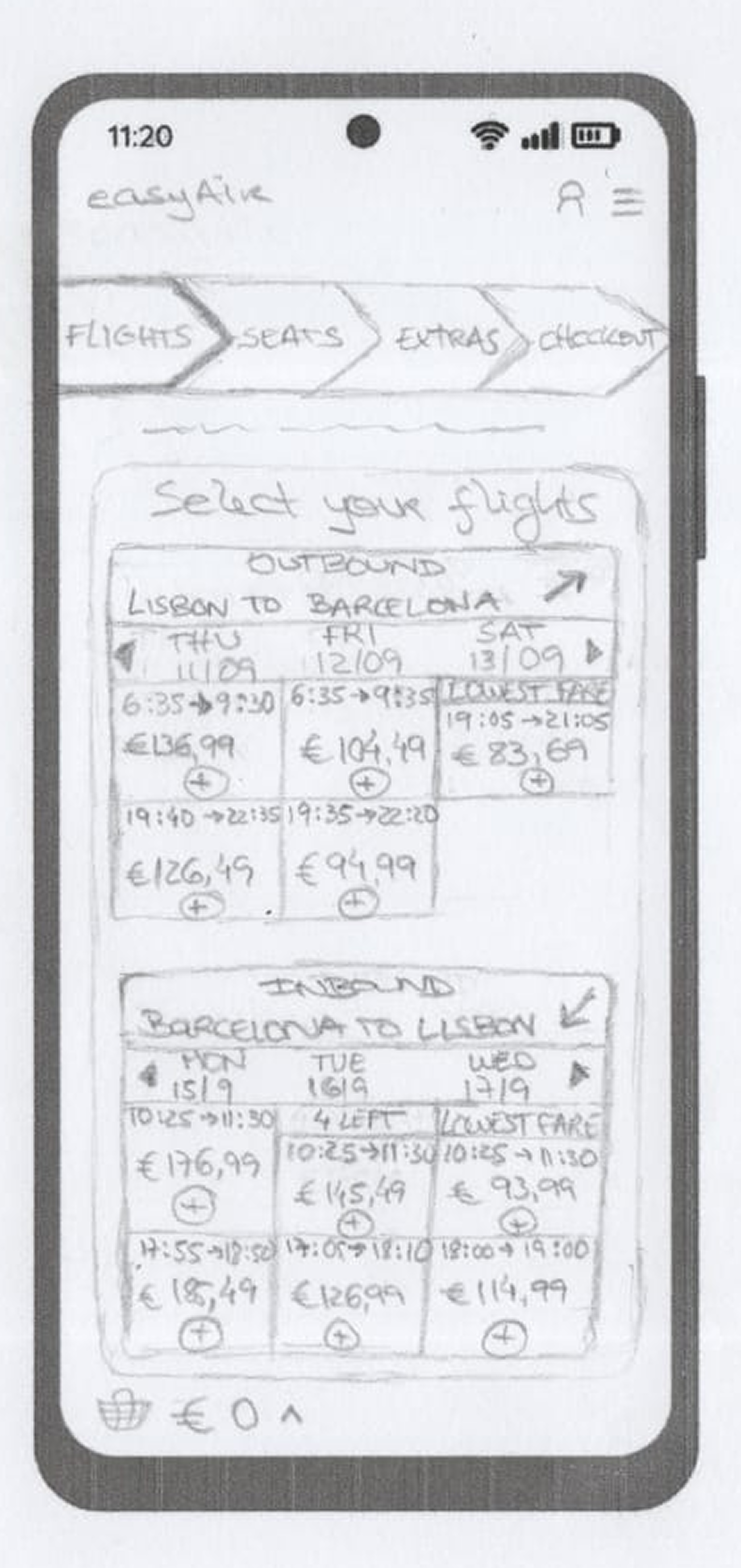
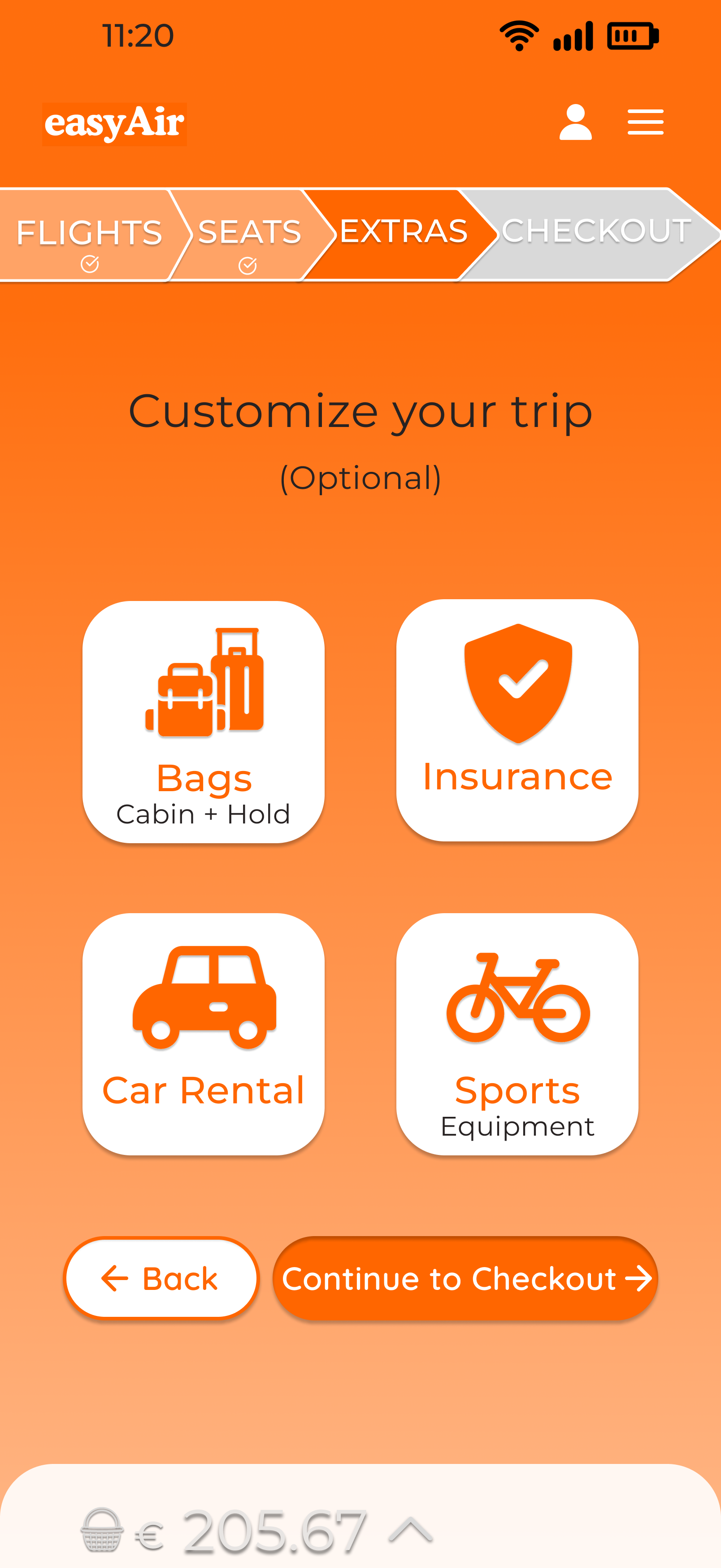
Reducing the flow was not about removing extras. It was about deciding which choices needed focus, which could be grouped, and where users needed more confidence before payment.
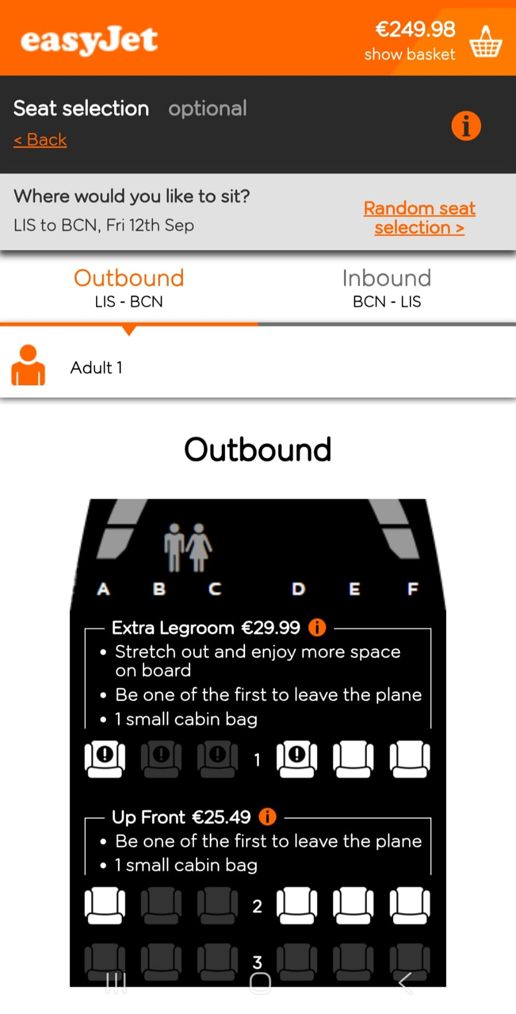
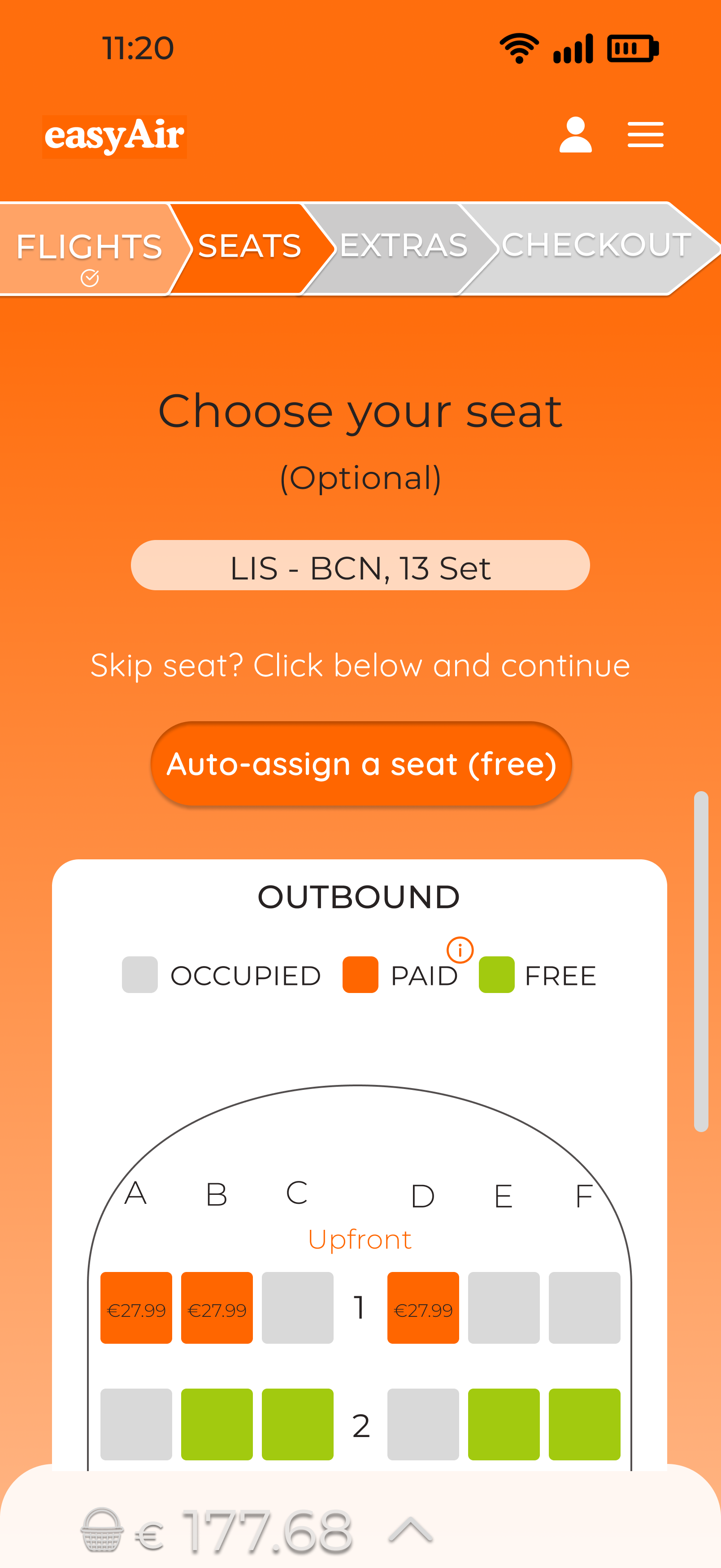
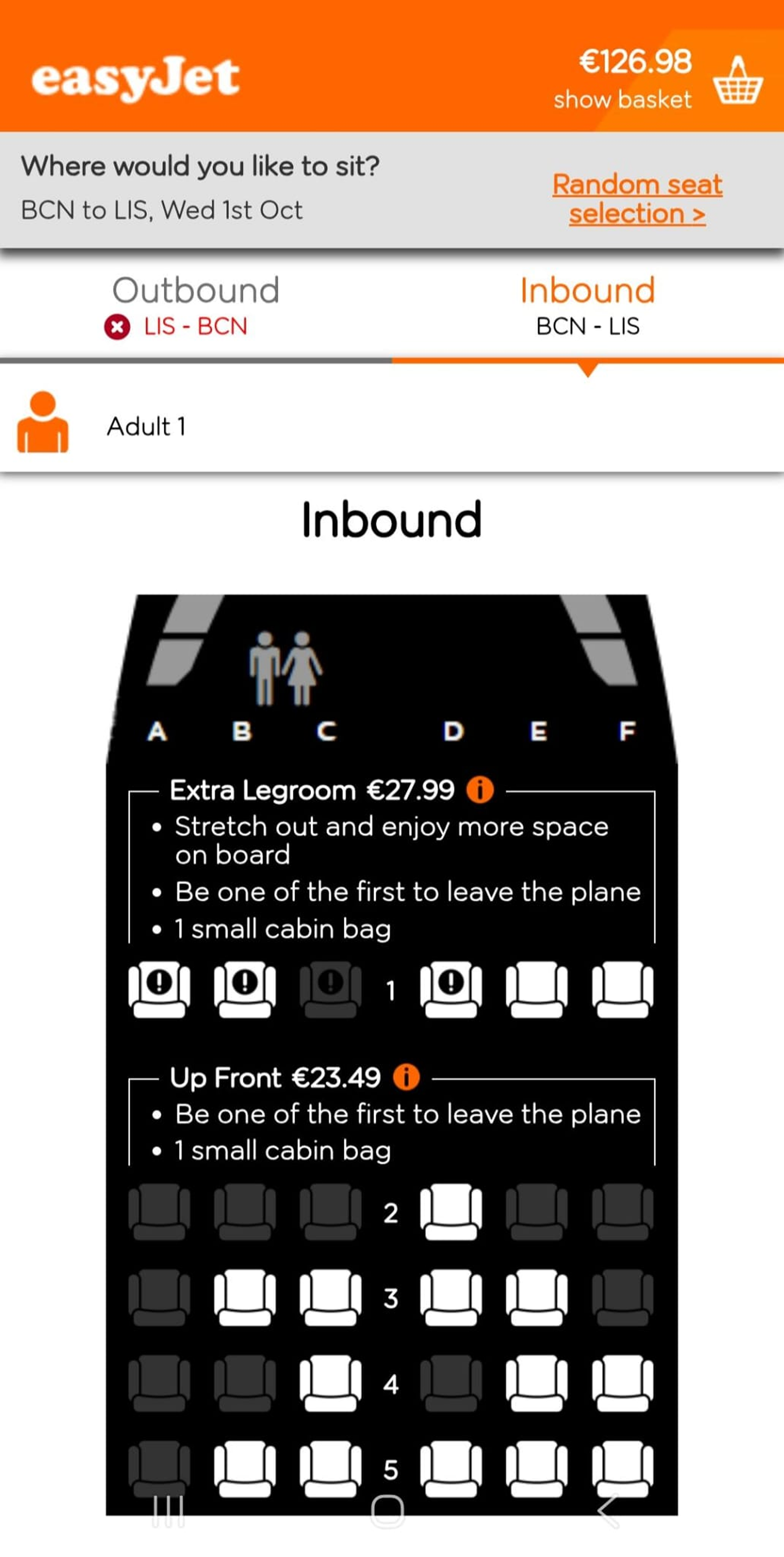
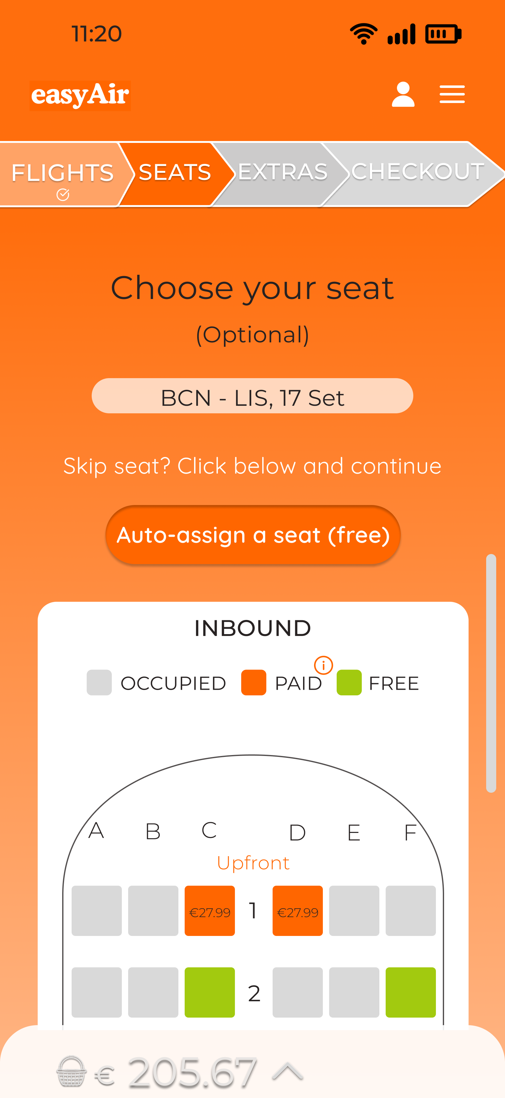
Seat choice is visual, personal, and high-impact, so users needed a focused step to understand and control it.
Bags, insurance, and car rental were combined into one step because they are optional choices users can review together.
The goal was not to hide business-critical options, but to make them easier to understand, compare, and change.
After simplifying the flow in wireframes, I translated those decisions into a lightweight visual system. Keeping easyJet’s familiar colour cues and straightforward typography helped the redesign feel clearer, more consistent, and still recognisable.
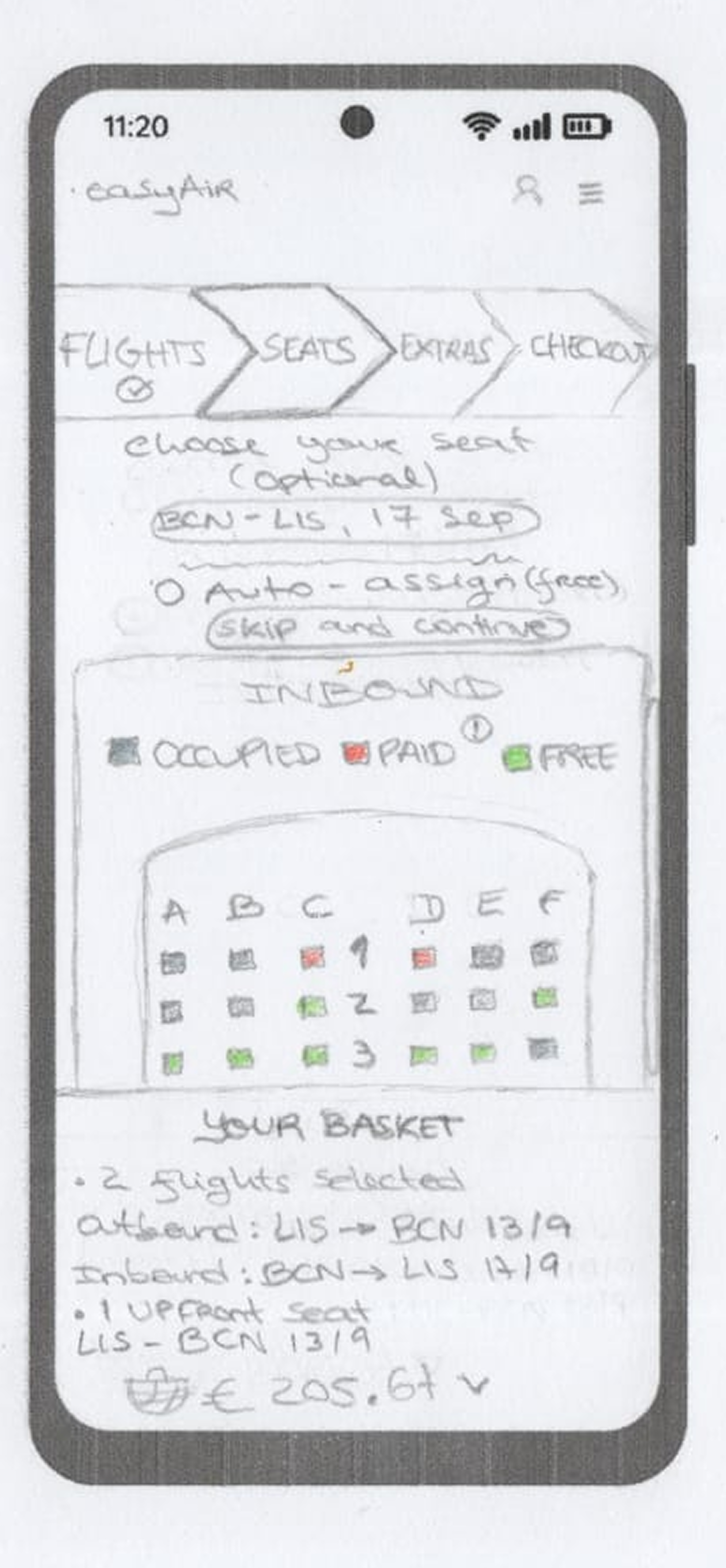
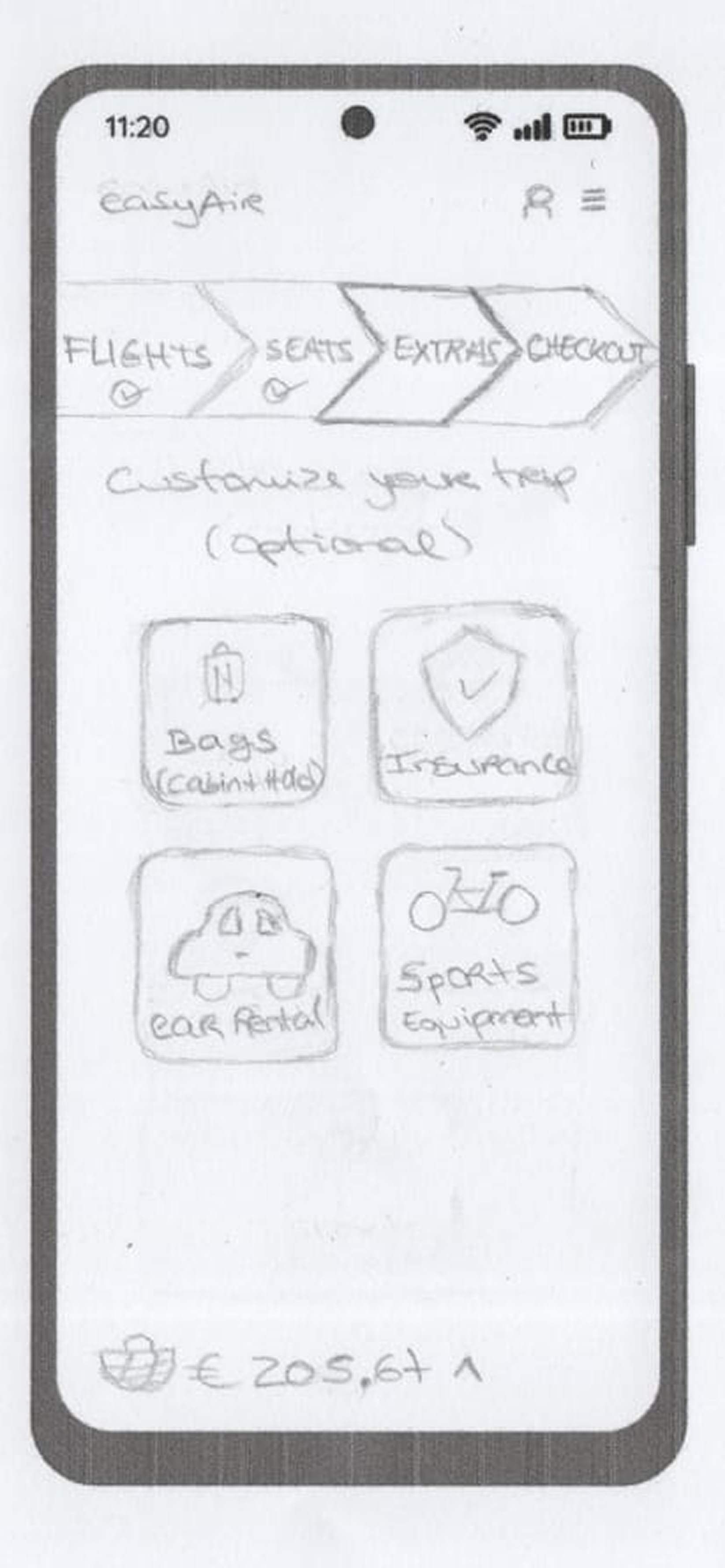
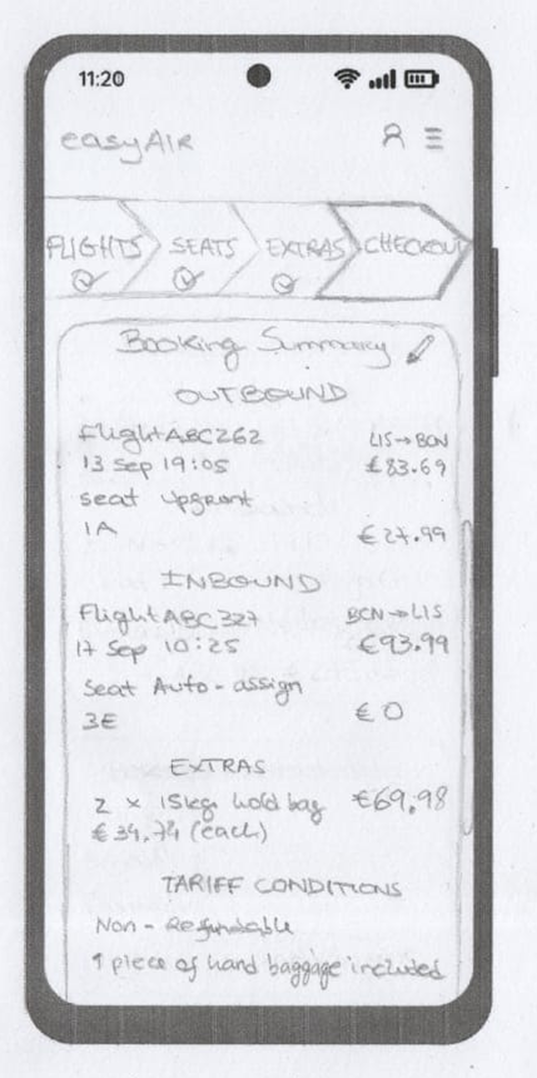
These wireframes focused on simplifying the booking flow, consolidating extras, and making key decisions easier to review before checkout.
To keep the redesign familiar, I used easyJet-inspired colour cues, simple typography, and repeated UI patterns that made the flow easier to scan and more consistent across screens.
Orange highlights primary actions and key decision points, while soft neutrals keep the interface light and easy to scan.
A clean sans-serif hierarchy supports readability and helps users distinguish headings, labels, and actions quickly.
Buttons, emphasis states, and visual cues help users recognise what to do next at each step.
Repeated layouts, button styles, and step patterns create a more predictable flow from flights to checkout.
Five participants aged 22–61 tested the original easyJet app and then the easyAir prototype, allowing a direct comparison between the two experiences. The feedback confirmed the main research findings and showed that the redesigned flow made booking clearer, faster, and easier to follow.
This was a qualitative comparison test focused on perceived clarity, speed, and confidence, not a statistical validation.
participants found easyAir clearer to use
participants found easyJetmore confusing to use
participants said easyAir felt faster
participants would rather book witheasyAir
The comparisons below show how the final solution simplified key decisions, reduced steps, and made pricing easier to review from flight selection to checkout.
easyAir shortened the flow, consolidated extras, and made pricing easier to understand. In testing, participants found it clearer, faster, and easier to follow than the original easyJet app.
Trust in booking flows is built through sequencing: when choices, prices and review moments are clear, users feel in control instead of pressured.